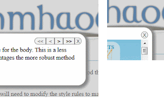
 When I was building something for my site, I liked the look of a rounded corner panel with rounded navigation buttons...something like this image, but was concerned about what it might look like if there were only one button. I didn't really want a single button to be rounded on one side and flat on the other, but I also don't really like the look of a series of round buttons (though I know that's popular for some interfaces). What I wanted is something that would show a single button as round and a series of buttons as rounded on left and right with straight edges between. Something like the image in the corner.
The question then became how do I do this easily so that I don't need to jump through hoops of counting the number of items in the navigation bar and figuring out which items need rounded corners.
As it turns out, it was very easy using CSS3 and border-radius. Since we're setting the border radius, it will easily degrade to square corners, which isn't terrible, even though I don't like it as much.
Here's sample HTML for what we're doing...
<span class="nav">
<input type="button" class=" disabled" value="<<">
<input type="button" class=" disabled" value="<">
<input type="button" class=" " value=">">
<input type="button" class=" " value=">>">
<input type="button" class="closer" value="X">
</span>
<input type="button" class=" disabled" value="<<">
<input type="button" class=" disabled" value="<">
<input type="button" class=" " value=">">
<input type="button" class=" " value=">>">
<input type="button" class="closer" value="X">
</span>
or
<span class="nav">
<input type="button" class="closer" value="X">
</span>
<input type="button" class="closer" value="X">
</span>
And here's the CSS (that's been tested in Chrome, Firefox, IE, Opera, and Safari, by the way) -
.nav > input { border:1px solid rgb(128, 128, 128); border-radius:0; cursor:pointer; }
.nav > input:first-of-type { border-bottom-left-radius:.8em; border-top-left-radius:.8em; }
.nav > input:last-of-type { border-bottom-right-radius:.8em; border-top-right-radius:.8em; }
.nav > input:first-of-type { border-bottom-left-radius:.8em; border-top-left-radius:.8em; }
.nav > input:last-of-type { border-bottom-right-radius:.8em; border-top-right-radius:.8em; }
It really is that simple.
The first-of-type and last-of-type both apply to the same element when there is only one. Now all I can say is "Wow! That was easy!" - and mean it.
Once that's done, it's just a matter of figuring out which font family/size to use, how much padding, and how much of a margin to place on the container so that everything lines up just as you'd like...that, and getting your designer to agree to it all - which will probably be the more difficult task.
No comments:
Post a Comment