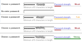
In order to be as secure as possible, we're encouraged to have strong passwords, but each site's idea of what makes a password strong varies and often users are left to guess what the requirements are until after they've tried to enter a password and it has failed the hidden validation rules. In many cases the only clue users have is a strength indicator that slides from weak to strong.
To improve the user's experience, I'm going to suggest you add a list of the hidden validation rules, something like the following.
- At least one lowercase letter is required
- At least one uppercase letter is required
- At least one number is required
- At least one special character from the following list is required: !, @, #, $, %, ^, &, or *
Additionally, it is going to be tempting to make these hidden validation rules present only during onboarding, when the user is creating an account. This practice will lead to unnecessary frustration when users try to login but cannot remember their password. The addition of the list of rules to the interface gives additional clues that can trigger a remembered password, so add the validation rules description list any time a user needs to input a password.
Additionally, when using this approach, one might consider hiding these rules behind an accordion or tooltip that is only displayed by some user action; however, I would recommend against that approach as it reduces the accessibility this practice improves.
Another word about accessibility here, and this is best explained through markup. As you will notice in the markup below, which creates the list, uses the aria-describedby attribute to tie the validation rules to the input.
HTML
At this point it may be tempting to include an icon - something like
<li><i class="missing"></i>At least one lowercase letter is required<li> - however, you should not do this, because it causes a fragmentation issue, which is when the accessible name of an item is generated by the first element rather than appending all elements together. Instead, use the listing as is and use a CSS pseudoelement ::before to generate content, otherwise you're likely to hear "warning sign" repeated for each item in the list and the remainder of the text will not be announced. There are ways around this, of course, but it's generally best to keep to the simplest method.In the near future, this pattern will be exposed in the roking react repo with automatic updates to the list as the validation tests pass. As with other components in the repo, accessibility issues will be resolved to provide the best possible user interface for everyone. Of course, you're encouraged to develop using this pattern in a way that meets your needs, even without using the roking react repo.
Happy coding.

No comments:
Post a Comment